The Brief:
Client had a site built on an old CMS that was very difficult to update and manage. The website was also badly in need of modernising and expanding.
With a flourishing business and frequent travel, the client needed a site that looked great, was easy to use, and integrated with his business workflow. He was pretty clear on roughly what he wanted the site to look like.
The Solution:
There were some tweaks, like using Gravity Forms conditional logic, that made his workflow much easier on him and on his clients.
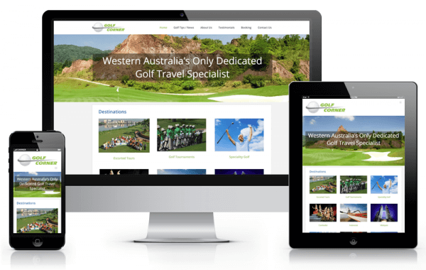
We built the site on WordPress with the Avada theme. We used lots of large images, carefully optimised for speed, to give a sense of open space and adventure, perfect for a golf tour company.
On the back end, the frequently used pages utilise Avada’s block and page level templates, so the client can get a new page out quickly. We cut out any special coding required to use the pages, working some extra behind-the-scenes magic to do the heavy lifting for things like table display.
The Reaction:
…
The Website:
See more at Golf Corner
