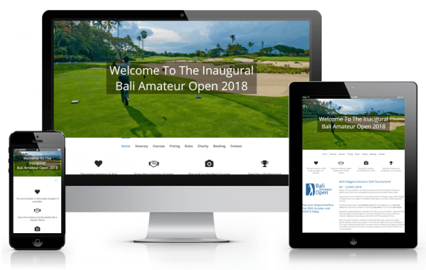
The Brief:
The second website we designed and launched for this client (see the other here). This was for a brand new domain and business venture they were running.
The design had to feel somewhat connected to their main site, but different enough that it didn’t feel like a pure extension of their main site.
With a deadline looming for them to start marketing for the tournament, we had to get a bit of a wriggle on to make sure it was finished in time.
The Solution:
To get that connection, we again used the Avada wordpress theme. We did away with the white blocks on faint grey background, while keeping a similar structure. That immediately gave a different feel, especially when coupled with a more blue colour scheme over their main green theme.
We were fortunate that the client had quite a few spectacular, high resolution photos of the courses and surrounds. That made it easy to choose the few that conveyed the feel we wanted on each page.
The Reaction:
Mike,
Once again, you have under promised and over delivered.
Right from the first meeting you had total understanding of what we wanted to achieve with the site.
We knew we were in safe hands when you sent the first draft, AND NAILED IT first time.
If Mike is not building your site, then GOOD LUCK.
Cheers
Paul Deans.
